

Bar Graph: Quick Data Overview
The Bar Graph Report is a quick, simple, and familiar-looking report of your results. While this report displays frequency in bar graph format by default, the appearance can also be switched to display data in other charts and graphs as well.
Generate Bar Graph Report
The following steps will allow you to generate a simple Bar Graph Report:
- Select your project and click on Report.
- On the Report menu bar, click on Frequency and select Bar Graph.
- Select questions you wish to add and click on Continue.
- Choose whether to toggle on Would you like to rearrange questions? and then click Continue to reorder the questions on the next step.
- Select properties that you want to display in your report:
- Display Percentage: Lets you customize the number of decimals to be displayed for response percentage
- Exclude All ‘Did not Answer’ is used to exclude the count of unanswered question from the number of total respondents for a question. Blank responses will not be displayed in the report.
- Include incomplete responses in the report is used to include partial responses that are yet to be submitted. Here, you can choose:
- All, to add all partially completed responses to the report
- Responses answered up to a specific question number
- Next, you may choose to apply a filter to your report based on desired conditions by selecting a filter from the dropdown list or by clicking on Create New to build a new filter.
- Click on Generate to create the report.
- If you wish to change the questions added or reorder them, click on Modify Report.
Report Details
Survey Metrics: Survey Metrics displays Date, Invitation, and Responses Metrics, which provide details about the responses included in the generated report. You may click on the Edit icon beside the Survey Metrics option to show or hide particular Date, Invitation, and Response Metrics.
Properties and Filters: Even after the report is generated, properties and filters may be modified from this section. You can edit, remove, or add the field which you want in the report by clicking on the Edit icon.
Modify Bar Graph Appearance
Follow these steps to change the appearance of your graph(s) within the report:
- Select your project and select Reports.
- Bar Graph Report will be generated by default.
- To modify a basic chart, switch from Basic to Advanced in the top right corner. Then use the Chart Type dropdown menu to make your selection.
- As desired, you may also choose your preferred colors from the Color Scheme dropdown.
- Additionally, you can click on ‘View chart’ icon at the top right corner to access the question level chart. Here, you may further choose to save or print the individual chart.
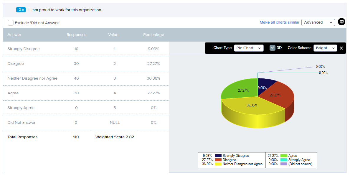
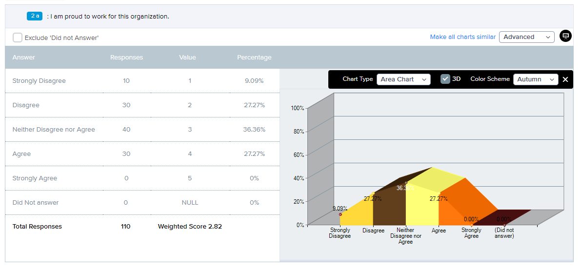
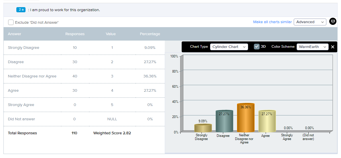
The following examples illustrate variations in graph type and color scheme.
- Pie Chart in 3D with color scheme as Bright.
- Area Chart in 3D with Autumn as color scheme.
- Cylinder Chart in 3D with WarmEarth as color scheme.
Clicking on ‘Make all charts similar’ will apply the current setting for that particular question to all the questions.
